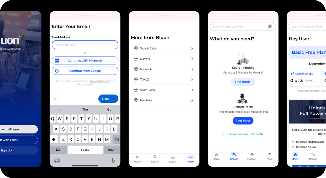
checkoutflow header graphic

Building an IKEA Table (Design System)

How I built a Design System in the same way as building IKEA furniture.

Project Overview

My role

Senior UX/UI Designe
Design Systems Lead

Teams

Design
Front-End Development
Marketing
QA

Duration

4 months

TL;DR

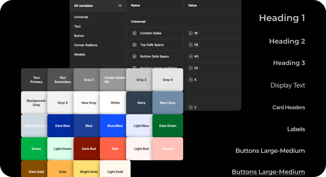
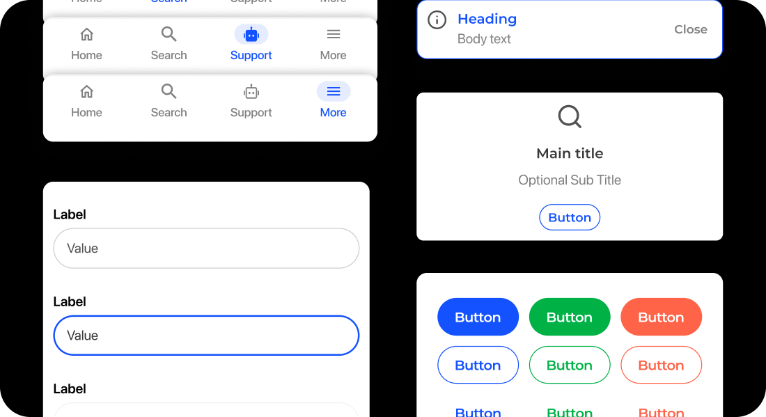
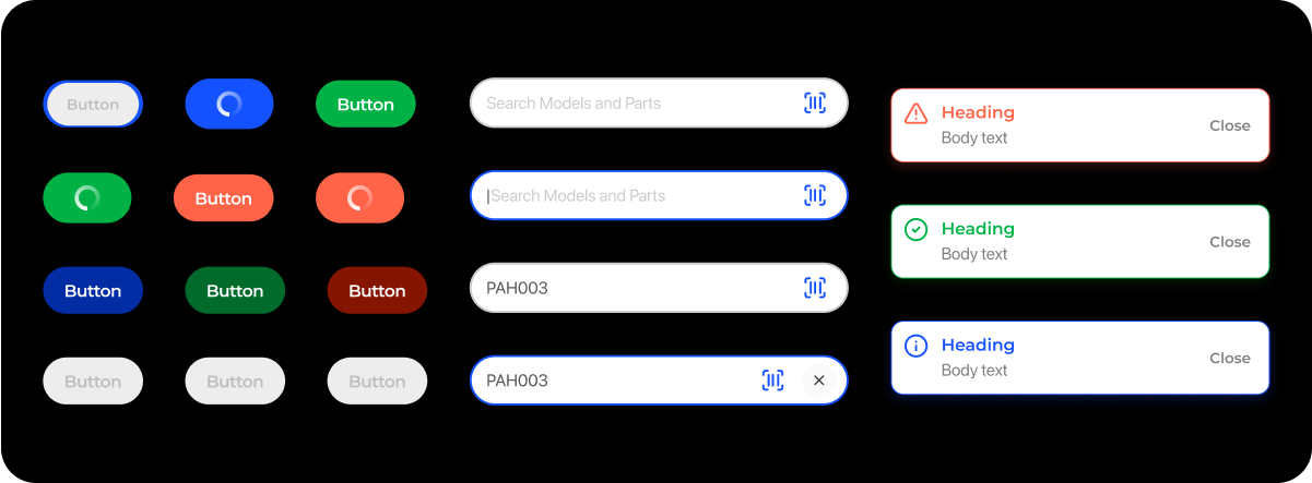
The goal of this project was to create a scalable design system for an existing mobile application that had grown rapidly over time. The product had been maintained by several teams with varying design practices, which resulted in inconsistent UI, duplicated components, and growing design debt. I led the end-to-end process of auditing, defining, and building the system, and worked closely with engineering to ensure implementation aligned with product and brand goals.

Main Drivers

think emoji

Inconsistent and fragmented UI:

Over time, multiple designers and developers introduced components without alignment. The app included several versions of the same buttons, input fields, and color styles, making it difficult to maintain consistency or ship features quickly.

think emoji

Technical debt and performance issues

Many UI elements were custom-built, leading to bloated code and poor reusability. Developers spent significant time maintaining or rewriting components across different screens.

waving emoji

Updated branding requirements

We set out to create a flexible design system for the app that could scale across all of our products. Leadership also emphasized the need for visual alignment across platforms to help establish a more unified and cohesive ecosystem.

Assembling the table piece-by-piece

nuts and bolts

Nuts and Bolts (Design Tokens)

We started by defining the foundational elements: color variables, text styles, spacing, and icon sizes. These tokens were applied globally across the system, giving every part of the interface a consistent baseline. They're the small but essential pieces that hold everything together.

think emoji
panels

Table Panels (Components)

Next, we built out reusable components: buttons, input fields, dropdowns, cards, modals, and more. These were structured and named in a modular way, so designers and developers could piece together full screens using reliable, pre-built parts—just like snapping together a tabletop with its legs.

think emoji
instructions

Assembly Instructions (Patterns)

Beyond the raw components, we created usage patterns for navigation, form layouts, list views, and onboarding flows. These helped the team understand how the components should be arranged depending on context. Patterns became the instructions that made the pieces work together smoothly.

think emoji
think emoji

Fix the wobbly legs months later (Governance)

Once the table was built, the challenge became keeping it clean and functional. We created clear contribution guidelines, a request process for new components, and regular audits to remove redundancies. Ownership was shared across design and development, with scheduled reviews to ensure quality and consistency.

Final Solutions

The design system was rolled out incrementally, starting with the highest-traffic flows. Over time, the product became more consistent, maintainable, and aligned with the company's visual identity.

Design System Example Design System Example Design System Example Design System Example Design System Example Design System Example Design System Example Design System Example Design System Example

Key Metrics

85%

screens redesigned using system components within the first three months of rollout.

< 5

UI related bugs reported within the first three months of deployment.

Reliable

components built greatly improving the speed of redesigning new screens.

Efficient

Design handoff as documentation and Figma libraries improved team alignment on how to build new screens and features.

Let's work together

Email

brian@brianprouty.com